Matching the Early Concept Images to Actual Game Engine.
![]() After messing about with Unity for a couple of days I am getting close the a render/shader finish that I think the game would suit.
After messing about with Unity for a couple of days I am getting close the a render/shader finish that I think the game would suit.
Here are a few images demonstrating my general progress and the comparisons of different stages.
Click on any image to see a bigger size.
|
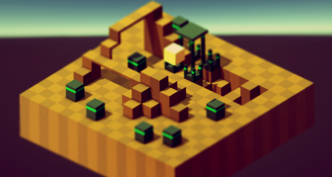
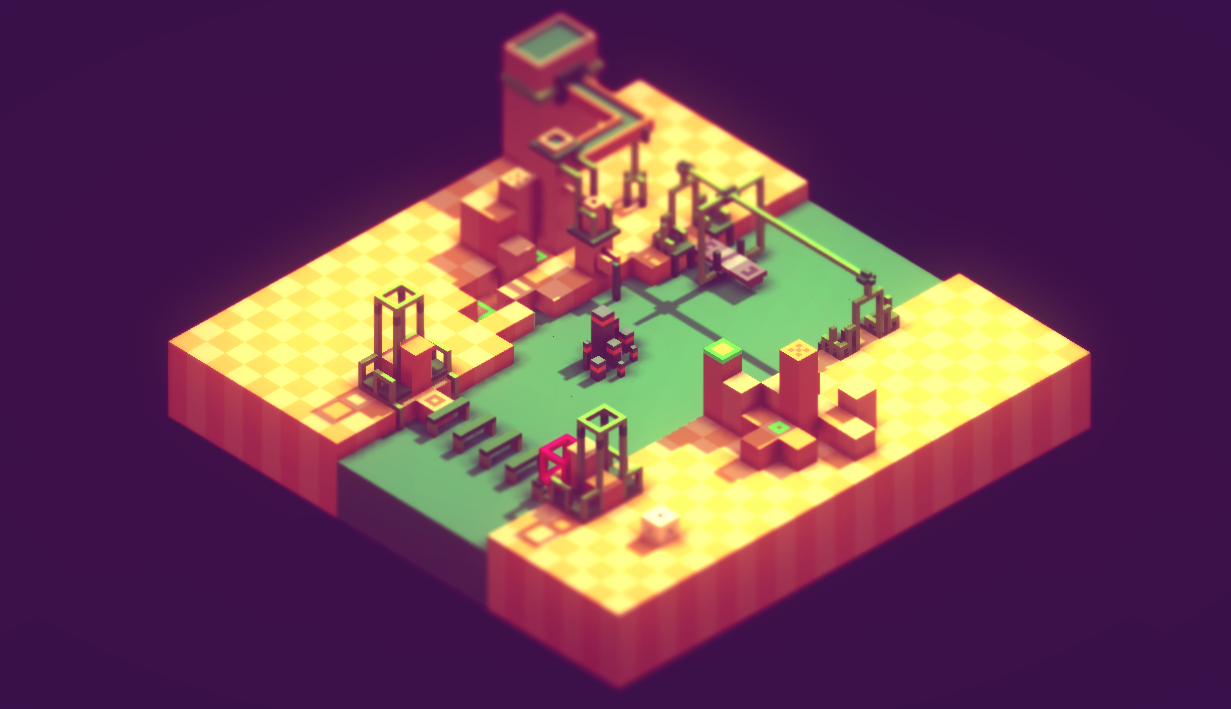
After some work in Photoshop this is what I end up with for most of those early concept images. So the mission here to try replicate this finish in Unity, using only its vanilla settings and preferably avoiding having to code anything myself such as modify unity shaders. I was not convinced Unity could get a finish close to the above image without code modification on its global shaders. |

After the first day this is the progress I made, its not quite there, but this is using a series of post effects only, including 2 AO screenspace camera shaders, various color/tone balance filters, contrast, and a touch of DOF.. with some other things. |
So today i found a new method to import magica directly into unity as individual cubes or one object, anyway the vertex color info come in a bit better then my other 2 import methods, so this is what it looks like in the unity standard shader. |
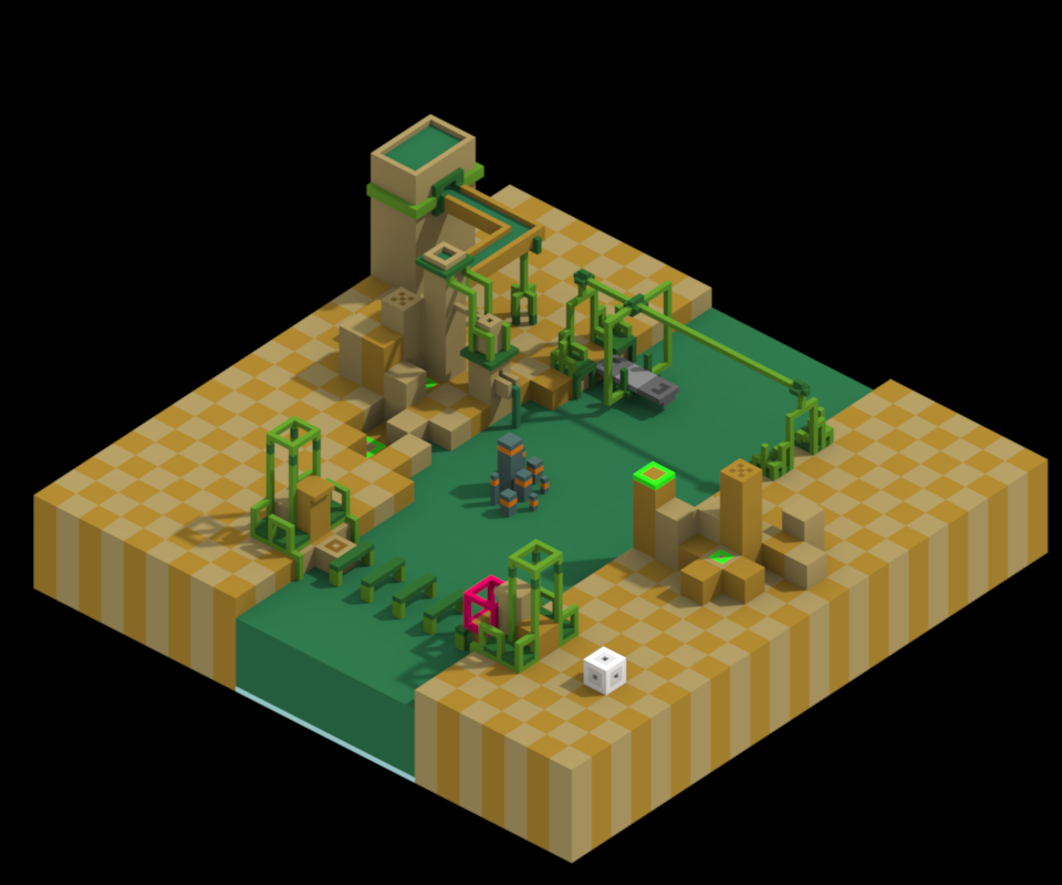
Applying what I learnt yesterday along with more fine tuning this is the result, and its only using 1 AO as apposed to the 2 used in the first unity test. So I think this is getting more and more close , if better then those original concept images. So far I am very very happy with my progress on the general render finish of the final game look, still needs tweaks, and of course none of these test models include reflection/refraction/emissive/ or anything like the magica/photoshop concepts... separating these elements in unity and applying them will make the above finish look even better. |
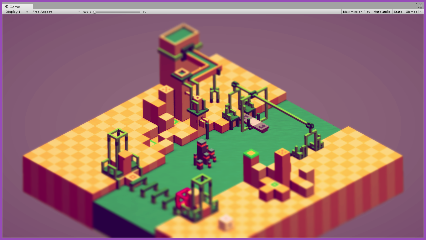
While in the process of trying to match the early concepts, I somehow got distracted and only realized that I lost real-time shadowing on the mesh. After some struggles I finally found out why this was happening, so the above image is even more refined shader which now has proper real-time shadows. |
__________________________________________________________________________